
Inspiring Artists (Updated!)
Updated: Sep 29
I’d like to introduce a few inspiring artists today!
When I was a student myself, I loved discovering artists I had never seen or heard of through my teachers and professors. So today, I’ll be introducing three artists. Their styles and generation vary widely, but each of them creates truly wonderful work.
They are not necessarily stippling artists, but we can adopt things we like about them.
Let’s dive into the artists I’ve chosen to share with you today.
Samuel Harrison
The first artist I'd like to introduce is Samuel Jackson.
Among the artists I’m sharing today, he’s the youngest—though I say “youngest” simply because the other two are veteran artists. Samuel is an active and rising LGBTQ artist, particularly prominent on platforms like Instagram.
He’s likely part of the next generation influenced by Tom of Finland, the legendary artist especially well-known within gay community. While Samuel has created works in a similar style, what sets him apart is his strong leaning toward fashion illustration. As he mentions in his bio, Samuel has a deep interest in fashion and beauty, and through his illustrations, he expresses the aesthetics he experiences within both the gay and fashion communities he’s a part of. His work carries a strong sense of cohesion and personal vision.
While his illustrations are mostly in black and white, his unique artistic sensibility shines through. I thought his work would be a great inspiration —especially when it comes to how a distinct world can be built even with a limited color palette, black and white.

Samuel Harrison is an artist and illustrator from London whose work mainly draws inspiration from the worlds of beauty and fashion.
From his love of pencil drawing, Harrison’s monochromatic style often focuses on exaggerated fabric compositions, graphic make-up details and dramatic poses.
ROSTISLAW TSARENKO
Next, I want to introduce an amazing stippling artist from Ukraine, Rotislaw Tsarenko, whom I discovered on Instagram a long time ago. His meticulous work and his concept of creating a series of black-and-white drawings are absolutely breathtaking to look at.
What I find especially fascinating is that his technique goes beyond stippling. He incorporates hatching and other pen techniques to create incredible textures, depth, and contrast. The amount of detail and patience in each piece is truly remarkable, making his drawings feel almost mesmerizing to study.

Ukrainian artist working in the dotwork, linework, and crosshatching styles. In my works, you can observe the ambiguity of meanings and messages, I do not set myself the task of conveying them to people - let everyone decide what he wants to see. I independently studied art and started with paints, pencils, felt-tip pens, and later settled on on graphic art.
Keegan Dakkar
Raised in the Lower East Side at the height of the anarchist and punk community of the ‘90s, Dakkar’s practice distills a lifetime of cultural influences and exposure. His visual art defies categorization, with group and solo exhibitions of his drawings in New York and Tokyo, a jewelry and fashion design portfolio including work for Marc Jacobs and Supreme, and a dedicated cult following of his idiosyncratic custom tattoo work.
By his estimation, Dakkar began tattooing “5 or 6 years ago,” and in that time, his art has found its way onto the bodies of hundreds of New Yorkers (including two members of our on-set crew) and the screens of tens of thousands more online admirers. He gives nearly exclusively custom tattoos, creating the design in collaboration with the tattoo’s recipient and embracing the improvisation of the moment.


His father was an original member of a well-known punk band "NAUSEA" and a great illustrator too.
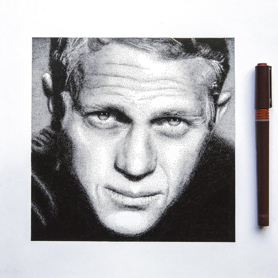
Little ink dots that transform into features and complex portraits.
Artist and illustrator Manuela Tertrin uses a drawing technique called stippling or pointillism, to bring to life the likenesses of the celebrities on this page.
Most are film stars and artists, that found the peak of their fame years ago. I am sure that even if you don't recognise the face, you have probably heard of their name.
To illustrate this technique in a little more detail, I have added a WIP to the Steve McQueen finished portrait. There you can see how the dots are placed and the areas are saturated to create contrast.
Nostalgia and a look back in time for some, for the rest beautiful art to enjoy. Not a bad deal right?


Aquirax Uno
Lastly, I'd like to introduce a very chic senior artist from my home country, Japan.
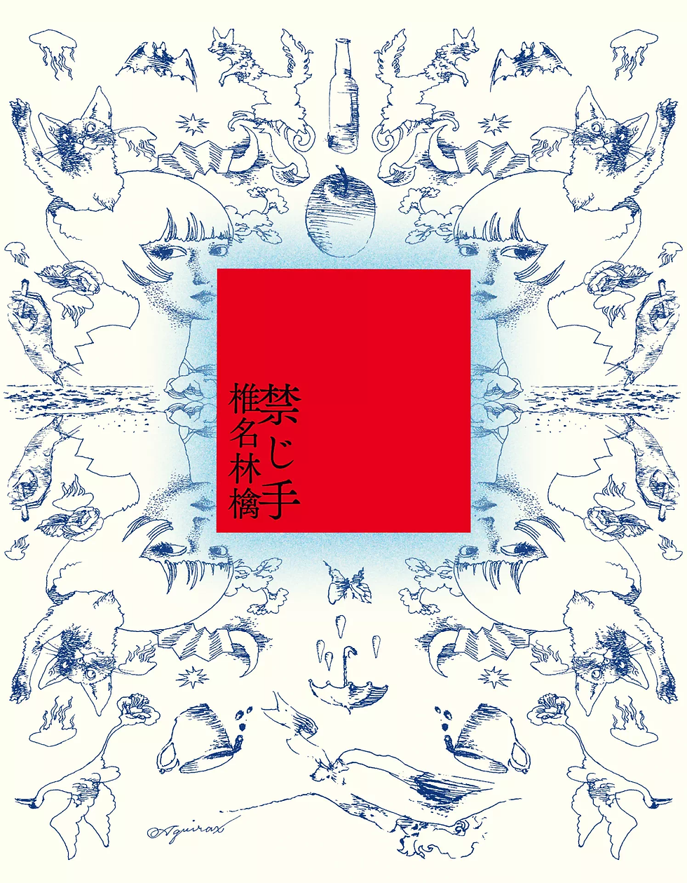
His name is Aquirax Uno (宇野 亜喜良), a 91 years old (as of 2025) Japanese illustrator—and still active!
His work has a unique, unmistakable sensibility, and he continues to create with incredible vitality. Of course, I’ve always loved his art and the world he creates, but I’ve also been deeply inspired by his attitude toward both his work and his life as an artist.
Some of you may remember that I introduced another legendary Japanese artist, Tadanori Yoko-o, in this class a long time ago. Uno was a close collaborator with Yoko-o in their younger years, which might give you an idea of how long and impactful his career has been if you know of Yoko-o.
Despite his influence, Uno remains somewhat unknown outside Japan—mainly (in my opinion) because he has no website or social media presence. He's not interested in digital media much, so it’s a bit difficult to find good archives of his work online. In fact, non-Japanese resources are very limited, which is a shame considering how brilliant and inspiring his art truly is.
I’ll share a rare interview in English I've managed to find, along with a translated excerpt from a Japanese interview where he said something I got inspired.
I hope you enjoy discovering his work as much as I did!

Aquirax Uno, is the alias of Akira Uno (宇野 亜喜良, Uno Akira) (born March 13, 1934), a Japanese graphic artist, illustrator and painter.
His work is characterized by fantasized portraiture, sensuous line flow, flamboyant (and occasionally grotesque) eroticism, and frequent use of collage and bright colors. Uno was prominently involved with the Japanese underground art of the 1960s–1970s, and is particularly notable for his collaborations with Shūji Terayama and his experimental theater Tenjō Sajiki.

Q: How does your sense of work differ between when you were a graphic designer and now?
When I was younger, I thought that painters and illustrators were different. In graphic design, illustration was about showing a company’s message or a product’s characteristics, and visualizing its functionality to the fullest. But since there are many materials that could be used in advertising, such as photograph, paintings or sculptures, why using illustration?
The illustrator’s ability to analyze and "this is the essential proposition" message may seem important in advertising, but in reality, it’s not that big of a deal. Even now, if something that looks like my art is needed, I’ll draw it, but that means they need the personality or character from my art.
So, it doesn’t really matter whether I live off only from illustration. In turn, I also feel that all the work I do, like stage design or creating murals, can be considered illustration.
Any visual projects that has functionality, conditions, and connects with people’s emotions can be called illustration.
Q: In this digital age, why do you continue to create through hand-drawn expression?
Honestly—I'm just simply not good with technologies lol. I don't even carry a mobile phone. I know I wouldn’t enjoy it even if it rang when I’m out.
But speaking from a creative perspective, when I’m developing new ideas or forms of expression, I don’t even think about whether I’ll use my hands or digital tools. I just feel like sketching by hand is actually faster to me.
In the end, even as technology evolves, the fundamental structure of what we want to express stays the same.
There’s a scene in the film Sherlock Jr. by Buster Keaton: a man tries to hang himself lying in bed, then suddenly sinks through the mattress and finds himself in a desert. The actor stays in the same position, but the background keeps changing in rapid succession. It’s a visual effect that requires a perfectly storyboarded vision—one where every movement through the changing sets has already been worked out in the creator’s mind.
Keaton could achieve that not because of technology, but because the entire mechanism was already clear in his head.
So in the end, whether it's digital or analog is secondary.
If the image isn’t fully formed in your mind, you will not able to bring it to life.
<English Interview>
Q:グラフィックデザイナーの頃と現在の仕事への感覚の違いは?
若い頃は画家とイラストレーターは違う、と思っていました。企業メッセージや商品特性を解釈し、機能を最大限にビジュアライズするのがグラフィックデザインでのイラストレーションだと。でも何が広告に一番効果的かというと、画家や彫刻家の作品、カメラマンの映像などイラストレーションになりうる人材や素材はいろいろある。イラストレーターの分析や表現の能力、「これがわれわれの本質的な命題」だという思いも広告に不可欠かというと、本当はたいした問題じゃないんです。いまも「僕らしいものが必要」であれば描くけど、それは、僕の絵の中の個性やキャラクターが必要だっていうこと。だからイラストレーターだけで一途に生きるとかはどうでもいいし、翻って舞台の仕事や壁画を描くことすべてがイラストレーションだとも思える。機能と条件を考えて仕事をした、人の気持ちに入っていくビジュアルは、すべてイラストレーションだとも言えるんです。 Q:デジタルの時代になって、敢えて手を使って表現し続ける理由とは。 単純にいうとメカニズムに弱い(笑)。携帯も持たないのも、外でかかってきても楽しくないだろうから。表現面でいうと、発展的に新しくモノを生み出すときに、手かデジタルか、を検討する必要がない。案外、ぱっと描いていくスピードの方が速いような気がしますよね。結局、メカが発達してもプリミティブにやりたいことは構造的には同じだと思うんです。「キートンの探偵学入門」という映画では、ベッドの上で首吊り自殺をしようとした男が急に沈み込んだあと、砂漠に行ったり、役者が同じ位置にいてもどんどん背景が変化する視覚効果が使われている。これって、変わっていくセットの中で、ファインダーのどこに自分がいくかの完璧な映像の絵コンテができあがってないとできない映像なんですね。でも、キートンの頭の中にはそのメカニズムがあったからできた。結局、デジタルやアナログという方法論はさておき、頭の中にちゃんと映像ができあがっていないとなんにもできないんです。 <Japanese Interview>
Have wonderful & inspiring rest of the day! :)

Comments